CRO 101: A Simple Guide to Boosting Conversions
September 23, 2025
10.10 Is Around the Corner: 10 E-Commerce Strategies to Boost Sales
September 23, 2025
1. Hard to Find Calls-To-Action Buttons
Have you ever had problems where you want to contact a company but don’t know how to do so? Or have you read a fantastic landing page but don’t know what are the next steps? These are all common points that companies miss out on when building a great website.
A potential customer should be able to find the CTA button to go to the landing page as much as possible. Somehow, many marketers fail to do this. Imagine the frustration of a potential customer when they can’t figure out how to contact you!
If you want to make lead conversion friction-free:
- DO put your CTA button on every page where you expect your potential customers to be.
- DON’T bury your most important CTA button at the bottom of the screen. Chances that your customers are bouncing off to another page after scrolling through half of the page is incredibly high.
- DON’T make your “Contact Us” form too long. If there is information that are completely unnecessary (ie. address when you’re not delivering goods to them), then cut them out! Nobody wants to give too much of their information without knowing you well yet.
Even if you have your your best products or services displayed, you might be losing sales because the CTA button to your “Contact Us” page is not easy to fill in. The most common issues are actually easy to fix. You can read additional tips about CTA buttons on this article about optimising CTA buttons for conversion.
2. If you’re doing eCommerce, poorly written coupon codes kill the conversion mood

If a coupon code is hard to read, it is hard to enter. Especially in a multi-channel environment, the goal should be a code that a consumer can read on one device and remember long enough to type it into another.
Consider these two options: 50OFF and 25SAVE. These combinations of letters and numbers are visually confusing and should be avoided. Also be aware of abbreviating and combining words, which could result in something being misread in a way you hadn’t intended.
Nearly as bad are coupon codes that are just a string of letters and/or numbers. Those are hard to read and hard to copy. The exception here would be single-use codes, which don’t have any other option. The very best coupon codes are easy to read and easy to remember. It’s easier to have standard codes, like “ACTIVE10” or “EXTRA20”. If you want to get creative, create codes that are on-brand with your company’s branding guidelines, so they are great both for conversion and for brand identity.
3. A potential customer has dropped out of your Contact Us page? Reach out to them again!
The amazing thing about HubSpot’s CRM is that you are able to tell who has done what on your site. For instance, if a lead has previously downloaded one of your ebooks, landed on your contact us page but hasn’t submitted a form, this lead may have some questions in mind. So, reach out to them to answer their questions before the warm lead turns cold!
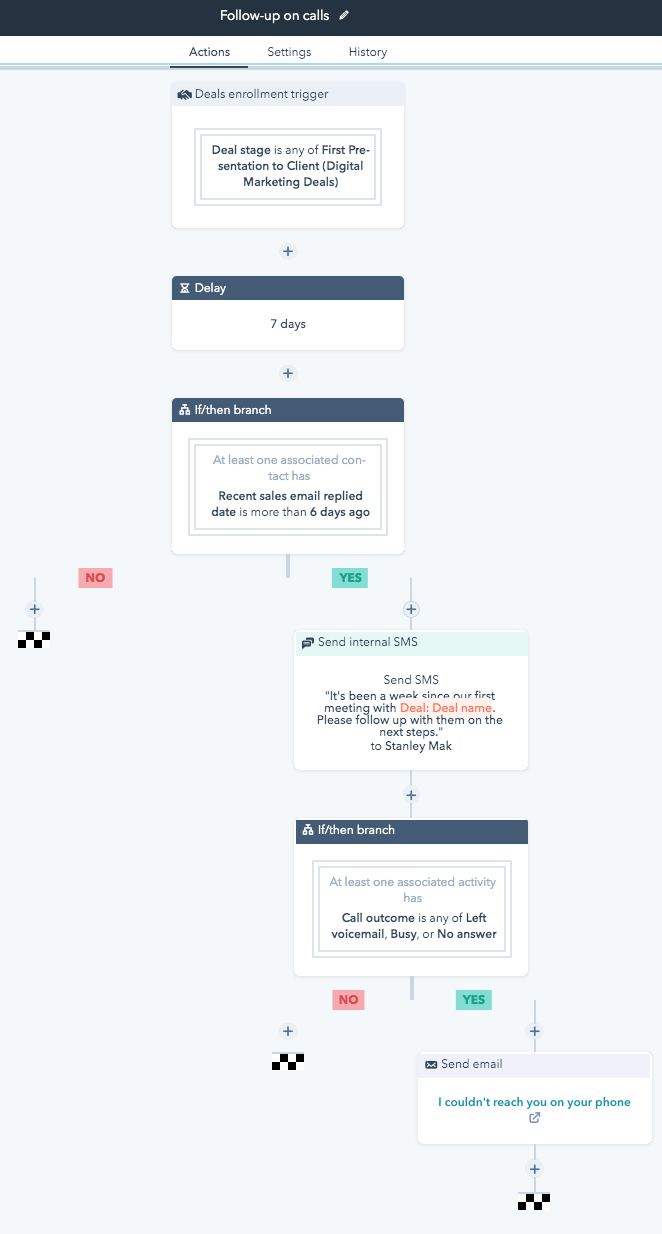
You don’t have to do it manually alone, you can build a workflow to automate this process. Here’s an example of how we do it on HubSpot:

With this automated workflow set-up, you don’t have to worry about forgetting to drop a thank you note, “You missed my call!” emails, or any other various touch-points. Everything is automatically delivered while you focus on communicating with your other prospects to sell more.
Those are our top 3 best tips to significantly improve conversion rates – all done through HubSpot. Remember: Always think in your customers’ shoes and you’ll be able to better convert. Think about their pain points, personalities, and how else you can better help them achieve their goals. By mastering these three tips, you are ready to sell better!
If you’re interested to learn how to plan and improve your conversion rate strategy, you definitely do not want to miss out on this guide that promises to help you improve conversions in 60 days. Download it today:


