Marketing Automation: Will It Save You Time or Cost You Customers?
October 2, 2025
3 Ways CEOs Can Participate In Social Media
October 2, 2025
Conducting an A/B test (or a split test) for the marketing elements of Inbound Marketing* website is a great practice for identifying effective ways to communicate your message and convert traffic into leads. Testing for website performance enables you to know which buttons, colours, images, etc. receive the most clicks or views, and the most strategic areas of the website layout on which these elements should be positioned.
To start off, the most important and memorable page for visitors would be your home page. It is essential to have your visitors drawn to the home page as that is where all your information is available to them. Included below are 7 A/B tests you can start running on your home page that could result in better conversion rates.
- Call-To-Action (CTA) buttons
CTAs are very important especially when it comes to selling or redirecting your visitors. They are a very powerful tool to generate sales leads. You can make many variations and changes to them like the colour, font, shape, placement, relevance, choice of words, etc. You can read more about the must-haves in CTAs here.
They all seem to be simple and easy to change and experiment, but one small difference can change your visitors’ attitude and behaviour towards your website and brand.
- Navigation bar
The navigation bar allows you to experiment with linking to website sections that drive the most traffic. You can also switch the order of your menu tabs, and measure which order works best for you. Besides reordering, you could experiment with the copy and font of the tabs.
- Login and signup buttons
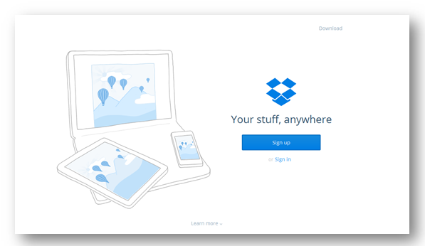
You have to decide on whether a login or a signup is more valuable for your company. Once you have decided on your priority, you could try swapping the order, changing the colour, changing the shape of the button (if there is any), or any other variations to gain more clicks for your focus.
An example would be Dropbox. This is how their home page now looks like, note the difference for login/signup buttons:

- Content offers
You should publish the most popular or key content offers on your home page. Test several offers at the same time or rotate them over a fixed time period to measure click-through or opt-in rate to determine the best-performing offer and promote that one aggressively.
- Images
Your images need to be carefully selected and make sure that they are sharp, relevant and add value to your home page. Some images may encourage more attention and engagement than others, different forms of images e.g. photos vs. illustration, can also impact the response of your website visitor. Test out the placement, different images, size, and other possible changes, and find out which best suits your website.
- Headlines
This is the most significant text of your home page, visitors look straight at this when they are in your home page to find out more about you. With this in mind, you should put in effort to create the best headline with an eye-catching copy and design.
- Hyperlinks
The way hyperlinks work is similar to CTAs, whereby the choice and phrasing of your words (anchor text) can impact differently. Strong words stand out more than others. You can try a different phrase or make use of a different colour of hyperlink to check which option affects your click-through rate.
Just remember, whenever you have new ideas, split-test them. Testing and tracking the performance of web design elements is a proven method to validate their effectiveness in digital marketing.
Related articles:
1) 6 CTA Tests For Maximizing Click-Through Rates
2) 6 Tips For A/B Testing To Increase Conversions
* Inbound Marketing is a form of digital marketing that involves SEO, Social Media, blog and landing pages to generate sales leads.
{{cta(‘d54cc04e-3cdc-4b79-845c-bc391be70411’)}}


