
How Query-based Keywords Help You Improve Your SEO?
September 28, 2021
Common SEO Errors and How to Avoid Them
October 5, 2021
Given the vast number of websites on the Internet, it’s easy to see how difficult it is to stand out from the crowd and have consumers remember their visit to your site in particular.
To elicit a response from consumers, most modern websites combine simple images and interactive elements.
Instead of focusing on how a website looks, web designers are instead focusing on how it is developed. The user experience is the only factor that can have a significant impact on a website’s bounce rate.
A positive user experience will result in a lower departure rate and a demonstrable rise in conversion rates or repeat visitors. Creating a user experience that is as close to ideal as feasible is a competitive advantage that everyone should be aiming for right now.
So, what is user experience, exactly?
It’s difficult to describe user experience since it encompasses so many variables that its boundaries are hazy. The behavior that a person exhibits when interacting with a website is referred to as user experience, or UX. Website and form design are both part of UX.
To put it another way, UX refers to how a user views a website and how simple it is to use. People will return to spend more time on this site if the user experience is better, which will encourage brand interaction.
What are today’s users’ expectations?
It’s time to work out how to improve user experience now that you know what it is. To improve the user experience of a website, you must first understand what users anticipate. Here are some things to think about:
The website’s speed
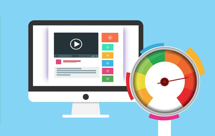
When it comes to user experience, speed is crucial. No one enjoys a slow website, regardless of how nicely it is designed visually. Even though it’s rare to come across a website that’s too slow to use, it’s always a good idea to apply speed optimization techniques when you can.
If a person detects that a website does not load within a few seconds of browsing it, his initial instinct is to go on to another one. What’s the end result? A high bounce rate will have an impact on your conversion rate.
The navigation menu
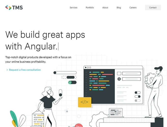
People must be able to quickly locate what they are looking for. A confusing navigation menu won’t get you anywhere.
A clean menu, on the other hand, that provides users with essential information will boost the chances of conversion. Pay attention to how you developed the navigation on your website.
Design elements
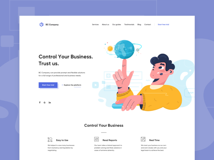
Although visuals play a significant role in the user experience, they are not the most crucial factor. A website that has been developed in accordance with current trends and is overall attractive to the eye will almost certainly yield positive results.
Even if your website was relevant for their searches, a website with low-quality visuals will not be appreciated, and users may never return. In this circumstance, as in any other, the first impression is crucial.
Responsiveness
Another important element to consider is responsiveness. Given the millions of people who only use their phones to access the internet, you should make your website mobile-friendly.
Your website should be viewable on a variety of devices, regardless of size. Non-responsive websites are frequently abandoned in a matter of seconds.
How can you improve your website’s user experience?
Now that you know what people anticipate from your website, examine what you can do to improve the user experience:
Keep it clean
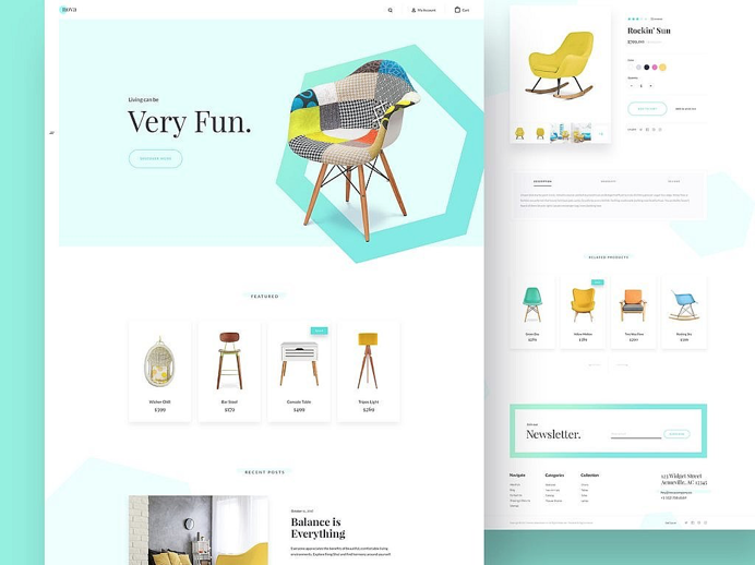
Complex designs are not as well-received as simple designs. The primary goal of a website is to assist the user in finding what he or she is looking for. The foundation of a good user experience is a clear website structure. Using a lot of different parts on your website can just slow it down and confuse the user, which is exactly what you don’t want.
The usefulness of a website is directly proportional to its simplicity. The navigation menu should be simple and quick to use. A difficult-to-use navigation menu will result in a poor user experience, making the website useless to visitors.
Use CTAs
Keep in mind that the goal of effective user experience design is to get visitors to come back to your website. This will not occur if they do not find the website to be relevant to their requirements. Use Call-To-Action components to help users find exactly what they’re looking for (CTAs).
These elements will provide users with directions, making it much easier and faster for them to access the destination they anticipate to find on the website. Make sure you understand color psychology and hierarchy design while developing CTAs.
These minor details can add up to a significant difference in the long run. The effectiveness of CTAs is determined by how strategically they are placed. As the name implies, you should employ action verbs to inspire users to take action. Make an effort to elicit an emotional response with the message you include in the CTAs.
White space is appreciated
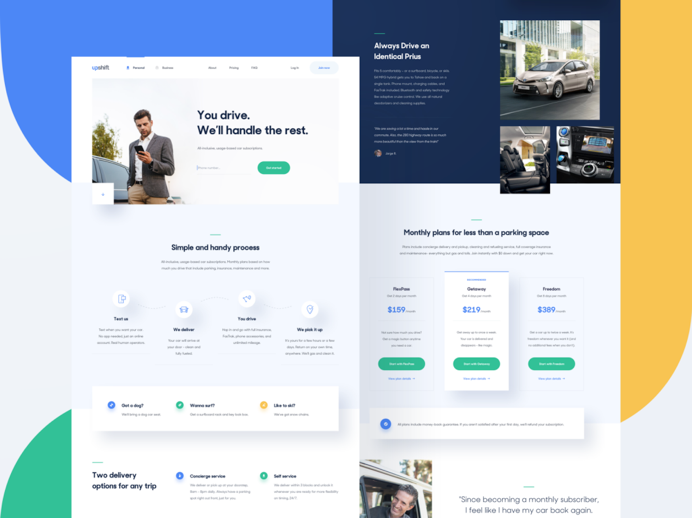
White space is frequently disregarded, despite the fact that it can be really beneficial. While providing the website an airy aspect, some vacant space allows viewers to assimilate the information they see. White space, as many web designers have noted, can make a huge impact in terms of user experience.
It can increase conversion rates simply by better delimiting material and allowing consumers to find what they want more easily. White space can also be used to draw the user’s attention to something when he first visits the website.
Deal with errors
Given recent developments in search engine algorithms, you might be surprised to learn that soft 404 errors are now one of the leading causes of a website’s demise.
If your website is functional but some of its links or options redirect users to 404 error pages, you must address the problem as soon as possible. Nothing is more aggravating than a disgruntled website visitor who is looking for something and ends up staring at a blank page.
To give users an uninterrupted experience on your site, fix the errors. Soft errors are not worth the consequences, so take your time checking out each option on your website and correcting any errors that arise.
Use headings
The use of headings makes it easier to skim through the content. As previously stated, time is a valuable resource for web users, so it’s understandable that they won’t read your entire content word for word. Simply ensure that the main elements are delivered and that the user assimilates them as quickly as feasible. Well-designed headings are one way to accomplish this.
Use animations
If not correctly optimized, animations can slow down a website, but they can also change the game entirely. Interaction is a crucial component of UX design, and you can’t avoid it just because it’s uncomfortable.
Micro-interactions called animations to assist consumers to become more familiar with a website in a shorter amount of time. Furthermore, animations pique people’s interest, especially if they’re altered on a regular basis. This may influence a user’s inclination to revisit a website in the future. Choose an animation-based UX design to give your website the right feel.
Use hyperlink differentiation
Adding links to information can help it feel more genuine and well-informed. Your primary goal as a publisher is to get visitors to click on the links you’ve included in the text.
Use hyperlink distinction to encourage this behavior. This implies that your links should stand out from the rest of the text. Use different colors, underlining, italics, bold, or any other option that you think would look nice on your website.
Use images
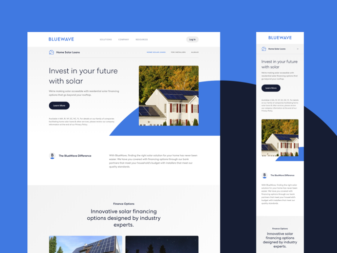 Instead of using generic photos, using your own high-quality images has a significant impact on users. Because most people use the Internet on a regular basis, they are all familiar with stock photos. Such photographs do not convey professionalism or individuality.
When creating a website, find your own distinctive style and use your own photographs. Generic photographs will not add to a positive user experience, whereas personal ones will, so choose wisely.
Be consistent
Another aspect that helps the user experience is maintaining consistency with your content publishing and website decisions. Visitors to your website will become accustomed to a particular tone, style, and level of content. Stay constant and attempt to keep your website on the same page to provide visitors with the quality they expect. Otherwise, users may become perplexed and lose faith in the website.


