What Is 11.11 And 5 Tips Used By Successful Brands In China
November 8, 2019
How Are Leads Converted Better By 25% With A Chatbot?
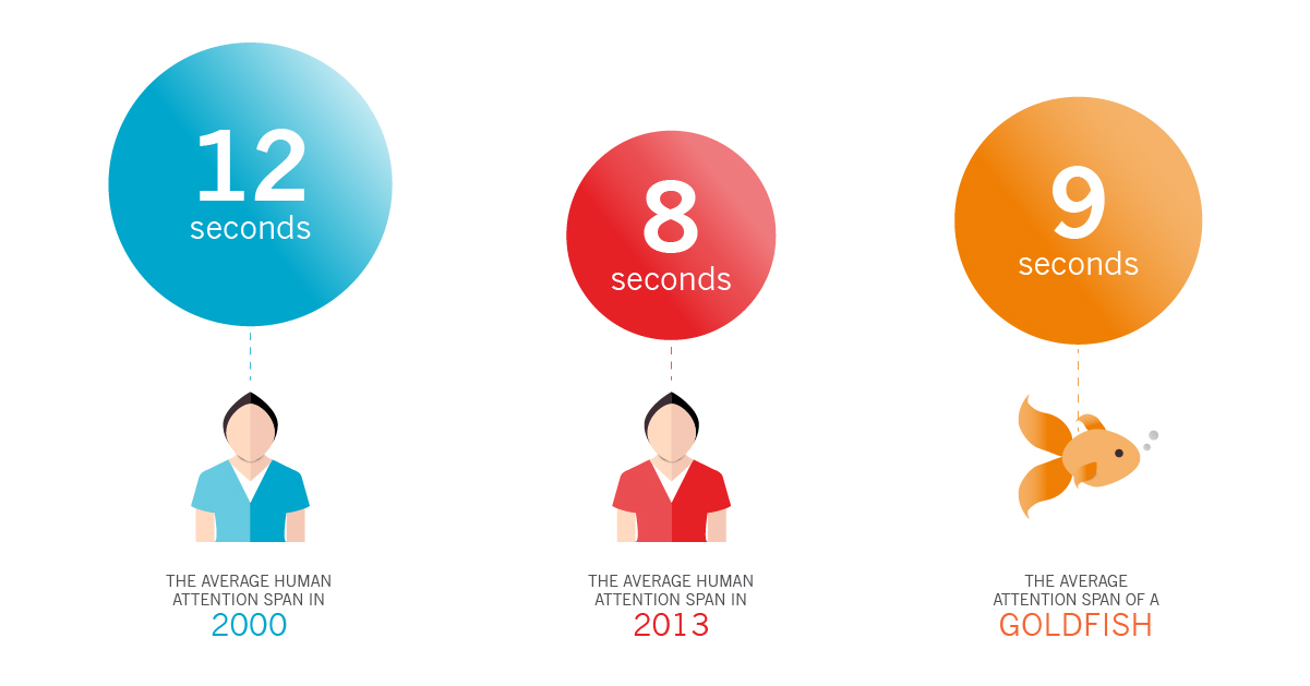
November 13, 2019There is a common misconception about attention that most marketers nowadays like to refer to: the average person has a shorter span of attention than the average goldfish!
But if you think about this statement, it may not be valid. Every day, people watch two and a half hours of long films and binge whole seasons of television shows. If the duration of human attention is less than eight seconds, there would be no Friends sitcom and Netflix would be out of business!

Nonetheless, there is something that truly shrinks in terms of diminishing human attention: our capacity to concentrate on specific tasks. With all the dopamine hits that updates from social media, email, and Slack bring, we are more than ever looking for instant gratification. And as our world becomes more electronically linked, it will only intensify these distractions, undermining our ability to concentrate.
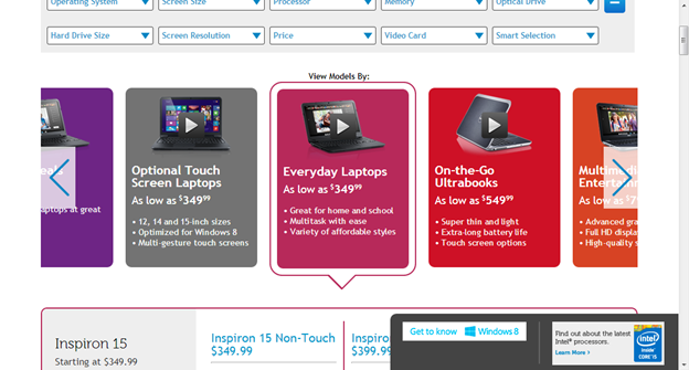
- The photo carousels, which are auto-rotating banners that sit above the fold on the homepage of a website, are a controversial topic in the conversion rate optimization community because of our ability to focus.

- We also distract users from the task at hand because their motion draws attention on an ongoing basis— and this may decrease the conversion rate of your website.

![]()
So why do brands still use photo carousels given their propensity to attract tourists in an era where people’s ability to focus is smaller than ever before? Okay, according to HubSpot’s website CRO strategist and copywriter Rebecca Hinton, brands often introduce photo carousels on their website because they are unable to settle on a hero image, which is the single image on the homepage of a website.
“Photo carousels may result from stakeholders who disagree on what the hero photo should include,” she says. A stakeholder who has to reach a certain objective, for instance, will claim that they will include their particular slide as the hero image while another stakeholder will argue for their own. As a consequence, by including all slides in a carousel, they can split the difference.
If the photo carousel of your website was the product of this predicament, it is natural to feel irritated. Nonetheless, there is no need to think about it.
- Photo carousels may not be suitable for conversions, but there are still plenty of ways you can customize the room for maximum impact.

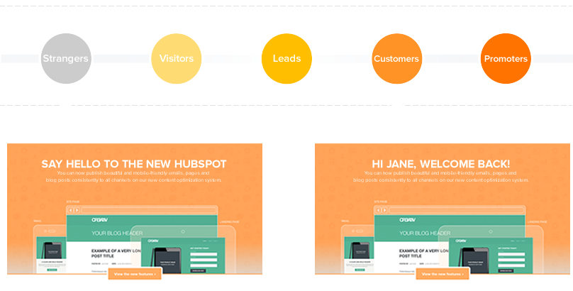
“If you’re on your website with an auto-rotating carousel, my suggestion is to turn off auto-rotation. Once you do this, decide how the room on your website can be optimized. Generally speaking, starting with a single message is easier than using a carousel, but before modifying your page, you should always run tests,” says Hinton. To answer the following questions, I would suggest running a series of A / B tests: what is the best carousel order? Could we replace a single image of the carousel? What is the best copy, image, or CTA? Sometimes, don’t think about customisation. Consider how you can change your carousel or hero photo to various groups of people, such as new users,
Consumers in our world crave instant gratification and become more easily distracted than ever before, so photo carousels may not seem perfect for attracting visitors to your website. Nevertheless, occasionally, due to an agreement between certain shareholders, you need to have a photo carousel on your website. And the only way to prevent your conversion rate from plummeting is to check and configure your carousel creatively using A / B testing.


